Bootcamp
Module 4 — Responsive design: one build, every screen

Photo by Kelly Sikkema on Unsplash
More than 70 per cent of web traffic is mobile, yet almost every new builder designs on a wide desktop canvas and hopes. Module 4 replaced hope with mechanics.
Responsive design is one interface that reorganises itself for any screen — not a shrunken desktop, and not a second app. It’s achieved with container structure and breakpoints, and it’s decided at build time, not patched afterwards.
The theory half
Eight lessons built the mental model: what responsiveness actually is; breakpoints and where to put them; adaptive versus stacking approaches; the mobile-first versus desktop-first decision (made on user data, not fashion); choosing formats with purpose; container alignments; and the tools and strategies to test as you go. The through-line: responsive behaviour is a property of your container structure. If your groups and rows are right, responsiveness is configuration; if they’re wrong, no amount of breakpoint fiddling saves you.
The practical half
Then students rebuilt their Module 1 landing page properly: mobile header and hamburger navigation, hero that reflows, services and testimonial sections that stack, a contact form that stays usable at 360 pixels wide, a footer that doesn’t collapse into chaos. Eleven build lessons, one page, every screen size — with an optional deep-dive on improving the tablet nav, because tablets are where lazy responsive builds go to die.
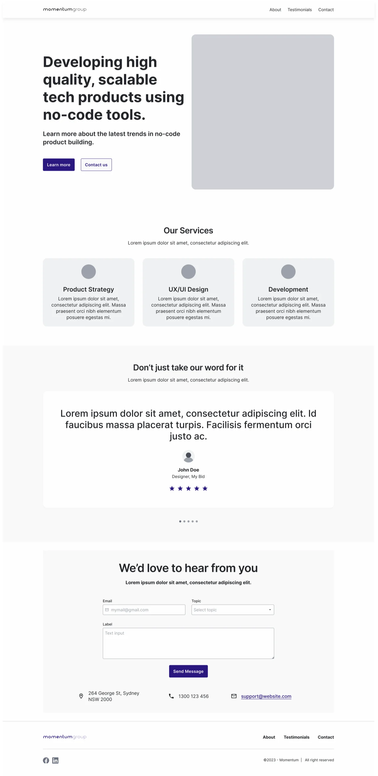
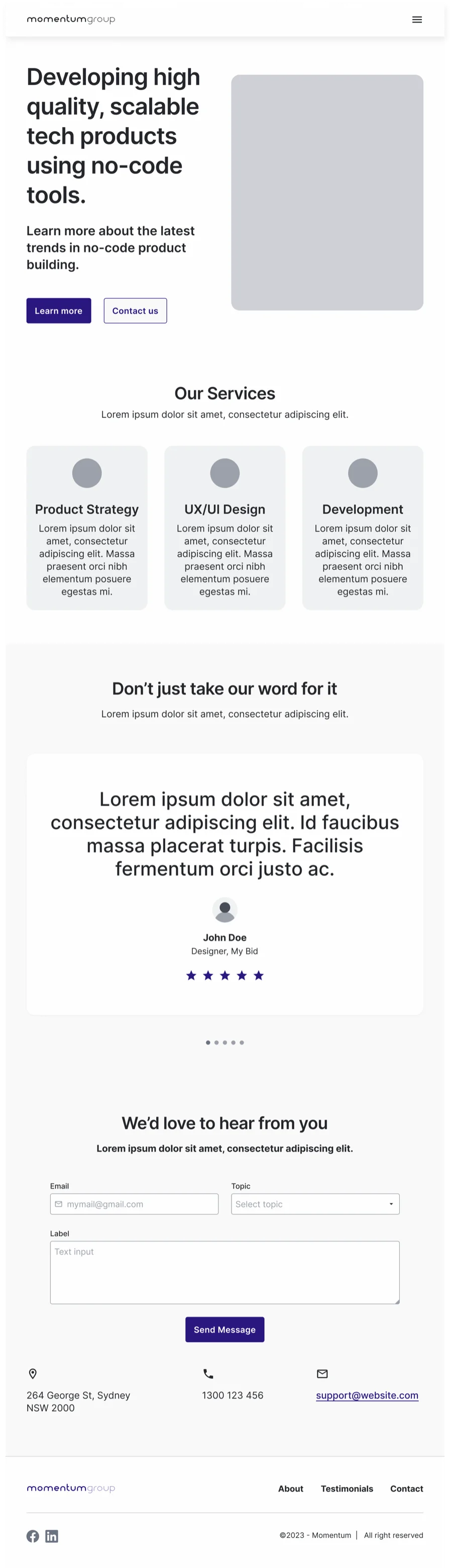

Try it yourself
Take any page you’ve built and view it at 360px, 768px and 1280px. Write down every point where you’d be embarrassed to show it. Then fix the containers, not the symptoms — group related elements, set them to stack below a chosen breakpoint, and let alignment rules do the work. One honest pass like this teaches more than a week of theory.
This skill in the AI era
Modern CSS and component frameworks — the ones AI tools write natively — have made responsive implementation almost free. What they haven’t automated is knowing what good looks like on a phone: what stacks, what hides, what a thumb can reach. When we direct Claude Code on a build, the responsive spec is ours and the flexbox is the machine’s — the division of labour Module 4 predicted. See it applied on our AI-built sites, or read the full story of the transition.
If this sparked something, let's talk.
No pitch, no pressure — just a conversation about what you're working on.
Let's talkRelated posts
Bootcamp
A simple approach to data modelling
A four-step method for designing a database schema: identify entities, map relationships, choose fields. Taught through the CRM data model built in Bubble.
Bootcamp
API calls as actions vs data (and the planning checklist)
When to use Bubble API calls as actions versus data sources, a one-to-many auth pattern, and the planning checklist that keeps integrations from failing silently.
Bootcamp
Module 5 — Application architecture: pages, states and reusable pieces
Single-page vs multi-page apps, URL parameters, custom states, reusable elements — and a big practical building a main template with an expanding navigation drawer.