Bootcamp
Module 3 — UI design: build a system, not a screen

Photo by Danae Paparis on Unsplash
Module 3 answered the question every technical builder eventually asks: why does my app look homemade? The answer is almost never artistic talent. It’s that professionals make each visual decision once, and amateurs make it every time.
A design system is the small set of decisions — type, colour, spacing, components — made once and reused everywhere. It’s why professional apps feel coherent and why their teams ship new screens quickly.
The curriculum
The module ran from mood to mechanics:
Setting the mood, picking fonts, defining a palette
Start with what the product should feel like — trustworthy, playful, clinical — because that decision drives type and colour. Then pick fonts (two maximum) and build a palette: primary, neutrals, semantic states. The course made students write these down before styling a single element.
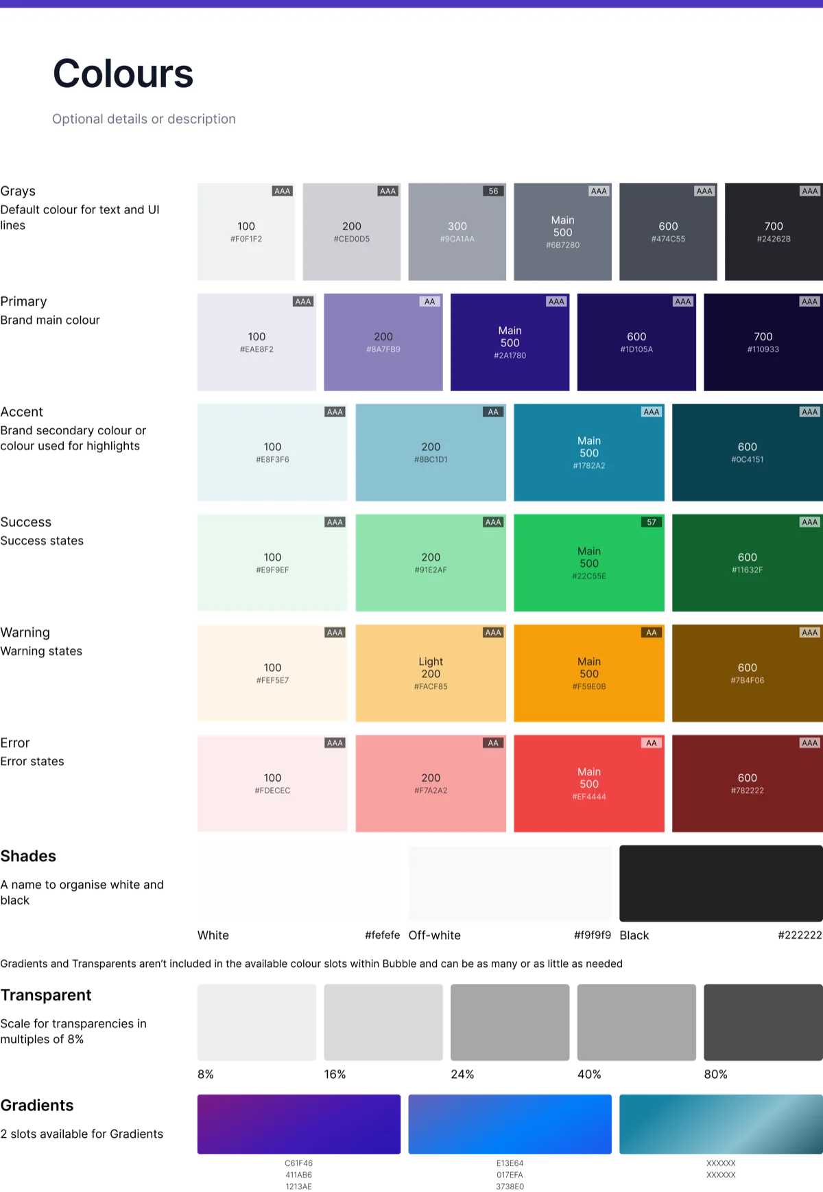 Decide once, reuse everywhere: the course’s own colour system — a primary, neutrals and semantic states, each step labelled with its hex and contrast rating.
Layout fundamentals and microinteractions
Spacing scales, alignment, visual hierarchy — and the small feedback moments (hover states, transitions) that make an interface feel alive rather than static. Microinteractions were taught with a warning: they’re seasoning, not the meal.
Styles and variables — the heart of the module
In Bubble this meant the Styles tab and style variables; in any stack it means tokens: define “Primary Button”, “H2”, “Card” once, and never style an element by hand again. Six lessons — configuring styles, font styles, primary buttons, secondary buttons, spacing, a full button audit — were spent on this single discipline, because it’s the one that compounds.
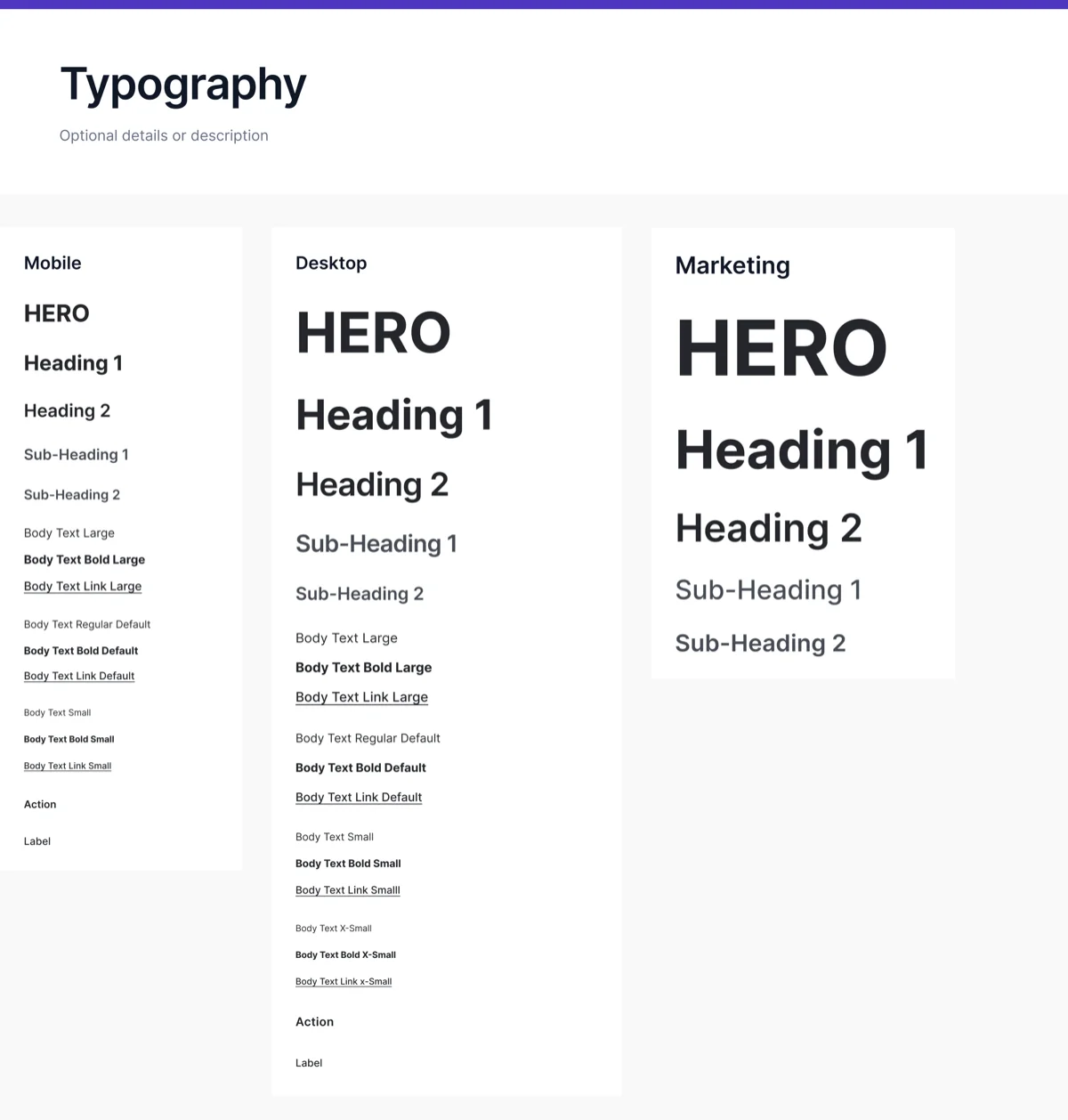 The same idea for type: one named scale — HERO, headings, body, label — defined once as styles and never hand-set again. This is exactly the “tokens” artefact an AI tool needs from you.
Icons, images and settings
Consistent icon sets, image treatment, and the app-level settings that most builders discover too late.
Try it yourself
Open anything you’ve built and count: how many font sizes, how many greys, how many button variants? Then define a system — one type scale, five colours, two buttons — and refactor one screen to use only those. The screen will look better and the next screen will be faster. That double win is the whole argument.
This skill in the AI era
AI tools generate UI astonishingly fast — and with astonishing inconsistency, unless you hand them a system. The teams getting professional results from Claude Code are the ones who say “use these tokens, these two buttons, this spacing scale” — which is exactly a Module 3 artefact. We build every AI website on a design system for this reason; the fastest way to a coherent product is still to decide once. Here’s how the whole approach carried over.
If this sparked something, let's talk.
No pitch, no pressure — just a conversation about what you're working on.
Let's talkRelated posts
Bootcamp
A simple approach to data modelling
A four-step method for designing a database schema: identify entities, map relationships, choose fields. Taught through the CRM data model built in Bubble.
Bootcamp
API calls as actions vs data (and the planning checklist)
When to use Bubble API calls as actions versus data sources, a one-to-many auth pattern, and the planning checklist that keeps integrations from failing silently.
Bootcamp
Module 5 — Application architecture: pages, states and reusable pieces
Single-page vs multi-page apps, URL parameters, custom states, reusable elements — and a big practical building a main template with an expanding navigation drawer.