Bootcamp
Module 2 — UX design: the process, not the polish

Photo by Marvin Meyer on Unsplash
Most people think UX means making an app that looks contemporary — like Airbnb or Uber. The bootcamp opened this module by dismantling that idea, because it costs new builders months: UX design is not what your app looks like. It’s whether it makes sense to the person using it.
User Experience design is understanding the user — their needs, goals, feelings, frustrations, capabilities and limitations — and advocating for them in every design decision. The core question is always: does this make sense to the person using it?
The process the course taught
UX is a loop, not a lightning bolt: research → define → design → test → improve. Module 2 walked it end to end:
User surveys
Before designing anything, students wrote and ran real surveys. The discipline: ask about behaviour (“what did you do last time this problem came up?”) rather than opinion (“would you use an app that…?”). People are honest about the past and hopeful about the future.
Competitor analysis
Every problem you want to solve is already being solved somehow — by a competitor, a spreadsheet, or a workaround. Studying that “somehow” tells you the bar you have to clear and the conventions your users already understand.
Defining the problem
The pivotal lesson: compress the research into one written problem statement. If you can’t state the problem in two sentences, you’re not ready to design a solution to it.
Information architecture and user flows
IA answers “how is everything organised?”; flows answer “how does one person do one thing?” Students mapped both on paper before touching the editor — because moving boxes on paper is free, and moving screens in a build is not.
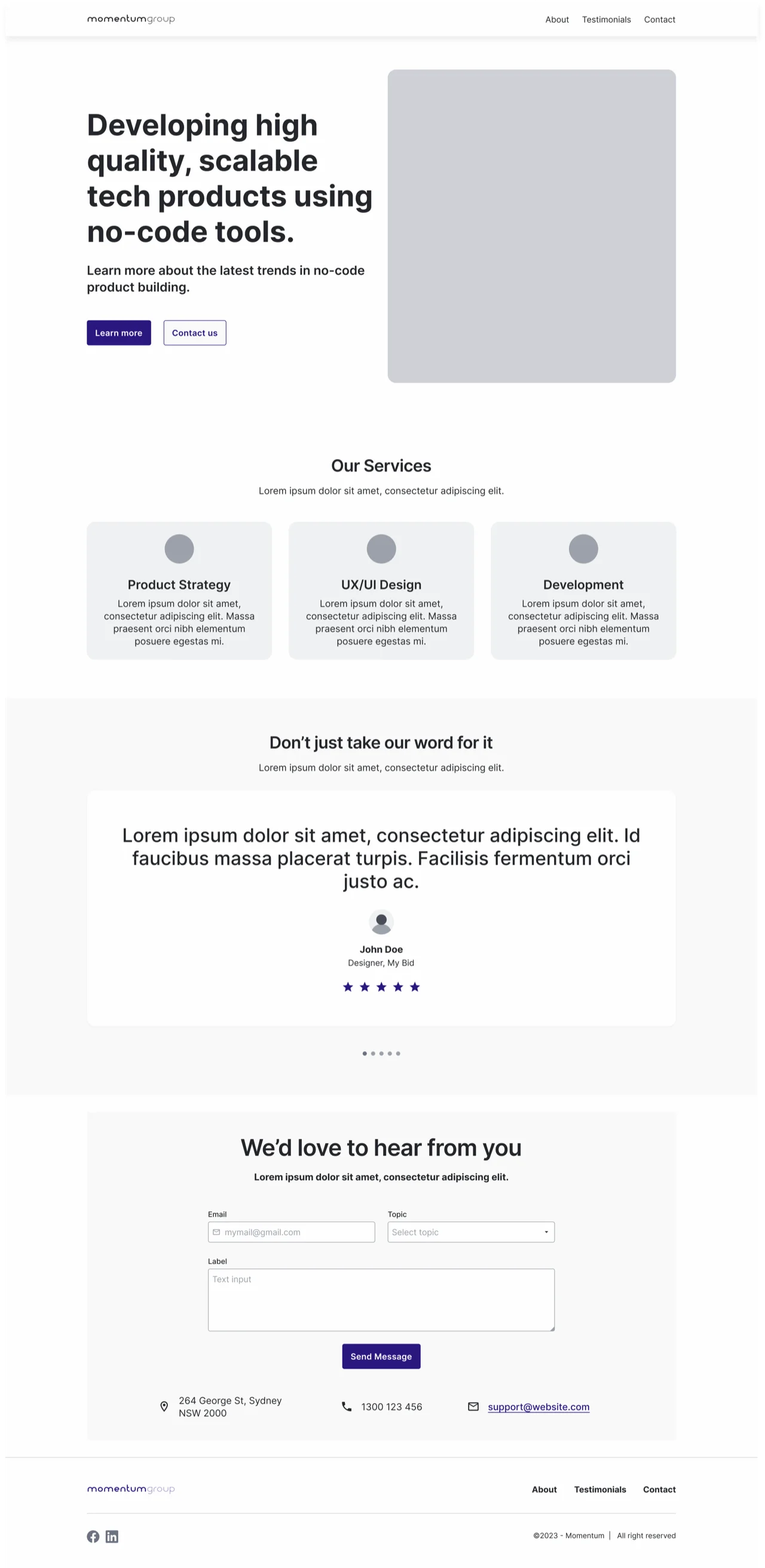 Structure before style: the same homepage as a mid-fi wireframe. Getting the boxes and hierarchy right while they’re cheap to move — the “process, not the polish” — before a single colour is chosen.
Usability testing
Then the humbling bit: put the design in front of someone and say nothing. Watch where they hesitate. The course’s rule was that you are not your user — every assumption survives exactly until first contact with a real person.
Try it yourself
Take an app idea you’ve been carrying around. Write the two-sentence problem statement, sketch the IA as a bullet tree, and draw the single most important user flow as numbered steps. Then show the sketch to one person who isn’t you. That’s a complete UX cycle in an afternoon — and it’s more UX than most launched apps ever received.
This skill in the AI era
AI coding tools have made building so fast that the expensive mistake is no longer bad code — it’s building the wrong thing quickly. Research, problem definition and flows are now the majority of the work that matters, because an AI can generate the screens in minutes once the thinking is right. This is the module we lean on hardest in our own AI app development work — and why great AI developers need what great Bubble developers needed.
If this sparked something, let's talk.
No pitch, no pressure — just a conversation about what you're working on.
Let's talkRelated posts
Bootcamp
A simple approach to data modelling
A four-step method for designing a database schema: identify entities, map relationships, choose fields. Taught through the CRM data model built in Bubble.
Bootcamp
API calls as actions vs data (and the planning checklist)
When to use Bubble API calls as actions versus data sources, a one-to-many auth pattern, and the planning checklist that keeps integrations from failing silently.
Bootcamp
Module 5 — Application architecture: pages, states and reusable pieces
Single-page vs multi-page apps, URL parameters, custom states, reusable elements — and a big practical building a main template with an expanding navigation drawer.