Marketing
Building a Website When You Don't Have Good Photography
There’s a conversation we have surprisingly often. A designer, a builder, an architect, a landscaper — someone whose work is inherently visual — needs a website. They know it. They’ve known it for a year. And every time it comes up, the same sentence appears:
“We just need to get the photography sorted first.”
Then the photographer’s quote comes in higher than expected. Or the project that would have made the best shoot is delayed. Or the clients haven’t given permission yet. And the website doesn’t get built — not this quarter, not the next one.
Meanwhile the business is invisible.
The cost of waiting is the compounding you’re not doing
Here’s the part that gets missed: a website isn’t a static asset that’s equally good whenever you launch it. Almost everything valuable about it accrues over time.
Search engines take months to trust a new domain. Every page you publish, every link someone gives you, every month you stay live adds to that. AI assistants — ChatGPT, Claude, Google’s AI Overviews, Perplexity — are increasingly where people ask “who does extensions in the Sutherland Shire?”, and they answer from what they’ve read about you across the web over time. Your Google Business Profile, reviews, directory listings and citations all want a website to point at. None of that starts until you’re live.
So the real comparison isn’t “average site now” versus “beautiful site later”. It’s a year of accumulated visibility, enquiries and reputation versus a year of nothing, followed by a beautiful site starting from zero.
An imperfect site that’s live is out-earning a perfect one that isn’t. And photography is the single easiest thing on a website to swap in later — new images, same structure, no rebuild.
The rule: launch with what you have, then upgrade the images when the budget and the projects allow. Never let the assets you don’t have hold the ones you do have hostage.
Get clear on what the website is actually for
Before the design conversation, the more useful one: what is this website supposed to make happen?
The instinct — especially for visual businesses, and especially when comparing yourself to competitors — is to aim for “wow, what a beautiful website”. That’s a natural goal for people who take pride in their craft. It’s also the wrong one.
Your visitor is not judging a design award. They arrived with a question and a decision to make: are these the right people to build my extension, design my brand, do my landscaping? The website’s job is to give them enough information to make that decision — and to make the next step obvious.
That reframe is liberating when you’re short on imagery, because the decision usually turns on things photography can’t answer anyway:
- Do they do my kind of work? — the specific service, the specific scale, in my area
- Have they done it before? — proof, and ideally proof for someone like me
- Can I trust them? — licences, insurance, years, accreditations, real names, a real address, reviews
- What’s it like to work with them? — the process, the stages, who I’d deal with
- What will it cost, roughly? — even a range, or an explanation of what drives price
- What happens if I get in touch? — who replies, how fast, and what the first conversation is
Write those answers down honestly and you’ll find you have a genuinely useful website before you’ve placed a single image. Get them wrong and no amount of photography saves it.
Work out who you’re answering for, too. A residential architect writing for homeowners on a first renovation needs to explain DAs, stages and fees in plain language. The same architect writing for a developer needs delivery, compliance and program. Same practice, different anxieties — and the content, not the photos, is what addresses them.
Take an inventory before you conclude you have nothing
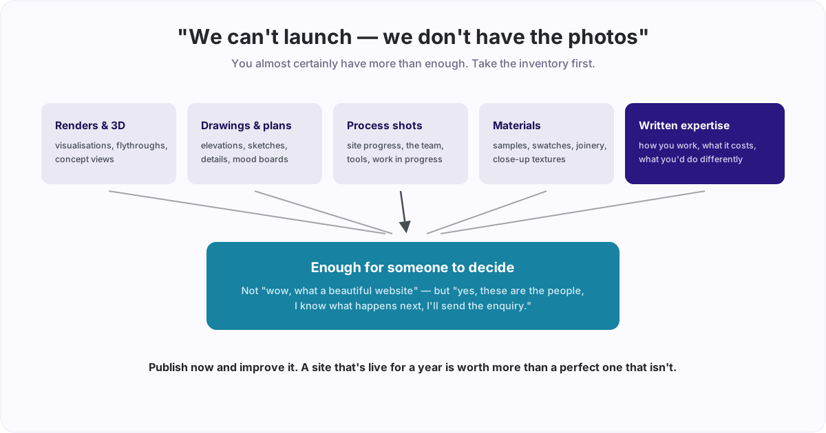
“We don’t have any photos” is almost never literally true. It usually means “we don’t have a professionally shot, styled portfolio”. Those are very different problems.
Sit down and actually list what exists:
- 3D renders and visualisations — for architects, designers and builders these are often the most polished visual asset in the business, and they were already paid for
- Plans, elevations, sections, detail drawings — cropped and used at scale, technical drawings look deliberate and expert. They also communicate competence in a way a photo of a finished kitchen doesn’t
- Sketches and concepts — early hand drawings signal process and thinking, which is exactly what a considered client is buying
- Mood boards, material palettes, samples and swatches — flat-lays of timber, tile, stone, fabric or paint shot on a phone in daylight look great and cost nothing
- Detail and texture shots — a close crop of a joint, a weld, a stitch, a finish. Tight crops forgive bad rooms and bad light; wide shots do not
- Process and work-in-progress — a site mid-build, the workshop, a hand at work, the team on site. This is often the most credible imagery you own, precisely because it isn’t styled
- Before and after — the single most persuasive pairing in trade and design marketing, and the “before” is allowed to be an ugly phone snap
- Diagrams — how you work, your stages, your service areas. Cheap to make, useful to read, and they fill a page beautifully
- Non-image proof — testimonials, review quotes, awards, accreditations, client logos, project stats, a map of where you work
Most businesses run this list and find they have twenty or thirty usable assets. That’s a website.
Written content is the asset you already own
If imagery is thin, words do the heavy lifting — and they’re better at the job than most people expect.
Good written content is how you demonstrate that you know what you’re doing. Not “we are passionate about quality craftsmanship”, which every competitor also says, but the specific stuff:
- How you actually work — your stages, in order, with what happens at each and what you need from the client. This is the single most reassuring page you can write for a nervous first-time buyer
- What things cost and why — a range and the drivers behind it. Almost nobody does this, and the ones who do get better-qualified enquiries
- The decisions you make and the trade-offs behind them — why you’d choose one approach over another for a given site or brief. Expertise reads as expertise
- The questions you get asked constantly — write the answer once, properly. These become your FAQ, and they’re also exactly what an AI assistant extracts when someone asks the same question
- The mistakes you see — what goes wrong on projects like this, and how you avoid it
This content is doing double duty. It persuades the human who’s deciding, and it’s the thing search engines and language models read to work out who you are and what you should be recommended for. A page of well-organised, specific, genuinely expert writing is worth more to your visibility than a gallery — because a gallery says almost nothing a machine can index.
If writing isn’t your strength, talk it out. Record yourself explaining your process to a client for ten minutes and have it transcribed and edited. The expertise is already in your head; getting it onto the page is a transcription problem, not a writing problem.
Design techniques for image-poor sites
Once you’ve accepted the constraint, there are established ways to build something that looks intentional rather than empty.
Use a photo as a background, not a subject. This is the highest-leverage move. Take your best-available image, put a dark tint or gradient over it, and lay your headline, one line of positioning and your call to action over the top. The photo becomes atmosphere; the copy carries the message.
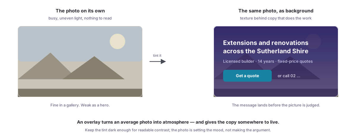
The mechanism is simple: a mediocre photo is only judged as a photo when you present it as one. Behind an overlay it’s texture, and the visitor’s attention goes where you want it — to what you do, where you do it, and the button. Keep the tint dark enough that the text has real contrast, and pick images with a calm area to sit type over.
A few more that work:
- One strong image beats six weak ones. A grid of average photos reads as an average business. A single good image, used large, reads as confidence
- Crop aggressively. Details survive bad conditions; wide shots don’t
- Let typography be the hero. Big, confident type with real white space around it looks deliberate. Cramped small text surrounded by empty space looks unfinished — the difference is whether the space is designed
- Use colour blocks and sections. Alternating background colours give a page rhythm and structure without a single image
- Apply a consistent treatment. Running every image through the same duotone, tint or crop ratio makes a mismatched set look like a considered collection. Consistency reads as intent
- Diagrams and illustration over stock. A clear diagram of your process is more useful, more original and more yours than a stock photo of people shaking hands
- Be honest about placeholders. If you’re using licensed stock for atmosphere, keep it abstract — textures, materials, landscapes — and never let it look like a claim about work you did
The through-line: restriction plus focus produces work that looks designed. Some of the best-looking sites in architecture and design are almost entirely type, space and one photograph.
Don’t skip the copyright question
This is where well-meaning websites get expensive.
- Never take images from Google Images or a competitor’s site. They belong to someone. Rights-holders and their agents actively scan for unlicensed use, and the letter that follows demands a licence fee far above what the image would have cost. It’s one of the more common unpleasant surprises a small business gets from its own website
- Check what you were actually licensed. Architectural, interiors and product photographers routinely licence images for a defined use and period — a magazine feature, a year of social — not “forever, everywhere”. If a photographer shot your project, confirm in writing that web use is included
- Photos your client paid for may not be yours. If the client commissioned the shoot, the licence is likely theirs. Ask before you publish
- Read the stock licence. Free libraries like Unsplash and Pexels are genuinely usable commercially, but terms vary by library and some images carry restrictions — particularly around identifiable people, trademarks and logos, and resale
- Get permission for people and private property. A recognisable person, someone’s home interior, or a client’s branding on a site — ask. A short written OK by email is enough, and it protects the relationship as much as the legal position
- Keep AI-generated imagery decorative. Fine for abstract and conceptual use; not fine for anything a visitor would read as a record of work you actually delivered
Keep a simple record — a note per image of where it came from and what you’re allowed to do with it. Five minutes now, and you never have to reconstruct it under pressure.
Then plan the upgrade
Launching without photography isn’t a permanent position, it’s a sequencing decision. So set yourself up to fix it cheaply:
- Write the shot list now. Which pages need which images, in what shape. When a good project comes along you’ll know exactly what to capture instead of improvising
- Photograph everything you do, badly, on purpose. Get in the habit of shooting every project — before, during, after — on a phone in daylight. Most of it won’t be used. The 5% that is will be worth more than a stock library
- Ask for permission upfront. Put a line in your contract or engagement letter covering photography and web use of the completed work. Retrofitting permission is much harder
- Commission one good shoot, not five. When budget allows, do one project properly. A single well-shot job, cropped and used across a site, transforms it
- Build so images can be swapped. Any competently built site should let you replace a hero image without touching the layout. If yours can’t, that’s a build problem, not a photography one
The point
You do not need a beautiful website. You need one that helps the right person make a decision — and that starts building your visibility today rather than next financial year.
You have the assets you have. Take stock of them honestly, let your expertise carry the argument in writing, use overlays and crops and space to make average imagery look deliberate, respect other people’s copyright, and publish.
You can make a genuinely interesting website without much good photography. It just takes focus, and a willingness to experiment.
Momentum builds fast, findable websites for Australian businesses — including the ones still waiting on their photo shoot. If you’re stuck at exactly this point, get in touch and we’ll tell you what you can launch with.
If this sparked something, let's talk.
No pitch, no pressure — just a conversation about what you're working on.
Let's talkRelated posts
Marketing
llms.txt, robots.txt and What AI Actually Reads on Your Website
robots.txt decides whether AI assistants can see your site at all. llms.txt is a newer, optional file that tells them what matters. Here's what each does, the AI crawlers worth knowing by name, the ways sites block them by accident, and an honest view of how much llms.txt helps.
AI Implementation
Build Your AI Middle Manager: Tracking, Chasing and Reporting on Autopilot
Good middle management is mostly diligence on a schedule: tracking commitments, chasing at the right moment, unblocking, and reporting upward. AI can carry 50 to 80 percent of it. Here's how we build an AI manager, and the line it never crosses.
AI Implementation
The AI-Native Stack for a Small Business or Not-for-Profit
Before you subscribe to a website builder, an email tool, a scheduler and a CRM, consider four layers instead: one Google Workspace, a website you own, Claude connected to your data, and Canva. Here's the architecture, what it replaces, and where it stops.