Legacy
Building an analytics dashboard in Bubble.io — a model

Photo by Joshua Sortino on Unsplash
Photo by Carlos Muza on Unsplash
Everyone loves a good dashboard. Or at least, that’s what a lot of technology proponents say! Undoubtedly as a Developer, you will be asked to build an analytics dashboard at some point in your career. Here is a step-by-step model that I use to build analytics dashboards in Bubble.
Before learning Bubble, I worked for 5 years in a Business Intelligence team in government, analyzing data sets and creating reports. Here is a little of my former life bought into the world of Bubble!
Underpinning this model is the idea that we should keep things simple, that we should try to create dashboards that work in real-time from the raw data, and that we should avoid additional processing steps that lock us into a less flexible approach when it comes to analyzing the data.
1. Work from the primary data model, and optimize the model for display in Bubble
Design your data model in such a way that it can be read for the kinds of data that you will want to show in your analytics dashboard.
In data analytics, your goal is to create star schemas with centralized fact tables containing the records we are aggregating (counting, sum-ing, averaging, etc) and peripheral dimension tables with the data we are using as filters or categories on our charts.
Star schemas are denormalized, meaning that we flatten our table structure somewhat for analysis, which differs from a normalized relational database model that increases the number of tables to reduce redundancy.
For example, if you need to create a dashboard displaying Orders, you would use the Orders table from your primary dataset as the fact table, and you would try to hold the references to all of the dimensions you wish to filter or “slice and dice” the data set by within the Orders table.
One practical way to do this is by ensuring you create relationships between the Fact table and all relevant Dimension tables when creating the data model, even if in some ways this creates redundancy within the dataset (i.e. unnecessary linkages between fact tables and their dimensions).
The order table below must hold the keys (e.g. in Bubble terms, have a field of type “Parent Category” and a field of type “Child Category”), if you want to have nice, easy filtering using these dimensions.
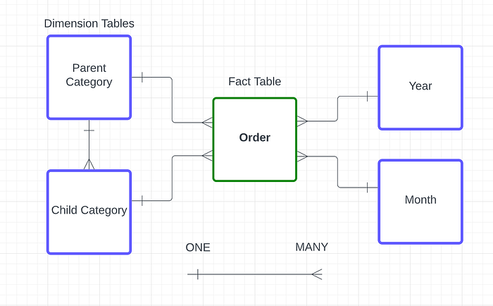
Organizing the Order table for Analysis as a Star Schema in Bubble.io. The “Order” datatype should hold references to the Parent Category and Child Category, even if this is not strictly needed in a normalized transactional database model.
2. Use Triggers to pre-calculate some aggregates
Now the data model is prepared, let’s say you needed to divide orders into average order values for the first order vs subsequent orders, you would have two options. One option is to write a beast of a frontend dynamic expression to try and calculate this expression on the fly. It might work, but it is likely it would have performance issues (aka it would be “slow as!”)
In this scenario, I would create a database trigger in backend workflows that sets a flag field on the Order, for example, named “Is First Order?” of data type Yes/No (Boolean). I would do a search for all Orders for this customer, order by created date, and if this order is the first order in the sequence, I would set the Is First Order? field to Yes.
Other examples of pre-calculated fields could include the count of items in the order, average item value, etc.
The main rule of thumb here is that pre-calculating values should not limit your ability to filter (drill down) later on. Otherwise, we are limiting the analytical flexibility of our dataset.
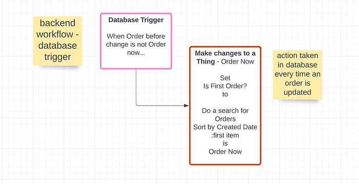
Example of a Database Trigger that fires off every time Order is updated.
3. Decide how to handle the time dimension
The time dimension is always an important dimension to consider. Analysis and reporting are not very meaningful unless it has some time context. Typically in analytics apps, we create a Calendar table, which is a table of Dates, Months, Years, or any other time division that is relevant.
This is important if we want to have dropdowns of months or years that we give the user to choose from.
However, in the most simple dashboards, a Start Date and End Date filter can be sufficient to give the user flexible analysis abilities, covering most use cases.
We also need to consider which datetime value we will use from the fact table when we apply the datetime filters. Is is the Created Date? Is it the Start Date? Is it the End Date? This can only be answered by the particular requirements of the use case at hand.
4. Create a master filters panel
At the top of your dashboard, create a list of dropdowns and search boxes that contain all of the fields you wish to drill down by (or slice and dice by as some would say). You should populate these dynamically, using the ‘do a search for’ expression. This will ensure you get no duplicates AND the list filtering is highly performant.
Get Will Ericksson’s stories in your inbox
We’ve already discussed having the start and end datetime fields in the master filter panel as datetime pickers.
5. Create a master repeating group for your fact table. Apply filters to this repeating group.
One neat trick is to create a popup containing your data elements, and reference these elements from your charts. Create a popup with a name like “Global data” or something memorable. Put a repeating group inside the popup.
Call the repeating group something like “RepeatingGroup Orders Var.” Using “Var” for these kinds of repeating groups means you can always find them quickly in text searches.
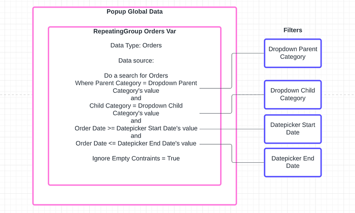
In the repeating group, search for orders and apply all of the filters as constraints. Make sure you select “Ignore Empty Contraints” = True so any filters without a value will not limit the search results.
Applying the filters to the repeating group in this way is easy to maintain, and is also performant in terms of using the relational database in the way it is intended.
6. Display your charts and tables using the master repeating group’s data and the :Group By function
Now you can use this master list, which will change every time the filters change, to generate the data sets for each of your charts throughout the app.
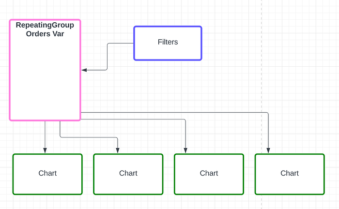
This will create an aggregate data set of the X and Y dimensions for each of your charts.
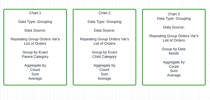
Then you simply need to choose a good charting plugin and display each of the charts in the way you’d like, using the output of the Group By function.
8. Create a way for people to see the raw data to validate it
I will finish this by saying there are a few things that people always ask for when looking at dashboards. Access to the underlying raw data is one of them. People usually don’t trust aggregate data, especially when it “looks funny”. Anticipate this and create a way they can view the underlying raw data.
9. Keep the charts simple
People love complex, funky analytics charts but in practice, these often hold little analytical value. For example, stacked bar charts try to fit one measure and two dimensions on the same chart. This is good for the overall measure but it is very hard to understand how the bar values compare as they are not side by side.
In practice, my tried and tested favorites are:
A line chart for time series data. The Y-axis has the measure (“total orders”). The X-axis has the dimension (e.g. “by month”). Simple. Easy. Everyone can understand it.
A horizontal bar chart for comparing categories. The Y-axis has the dimension (e.g. “Parent Category”). The X-axis has the measure (“total orders”). Making the bars horizontal allows the labels to be readable and longer than very short text strings. A simple bar chart allows for easy comparison of the size of the bars. Easy. Simple. You won’t lose your audience.
Big numbers are nice on operational dashboards, to give a relevant KPI total (“total orders this month”), sometimes some contextual information (like % change from the last month), and a way to take action (“review orders”).
Pie charts, but only in situations where you have less than 5 categories, and you want a picture of how they make up the whole. More categories and it is not readable. Pie or Donut charts can funk up the look of a dashboard, but they can also get out of hand and not offer much analytical value if they are crowded.
Conclusion
Bubble allows you to create rich, interactive, performant operational and analytical dashboards within your applications. By following these steps, you can create a flexible and useful dashboard for any reporting purpose.
For help designing and building analytical dashboards in Bubble, reach out to [hello@momentumgroup.tech](mailto: hello@momentumgroup.tech) or visit momentumgroup.tech.
Looking to learn and build a career in Bubble? Join our for a 8-week intensive Bubble Bootcamp at Momentum Academy
Where this story went
We spent five years mastering Bubble. Now we build with AI.
Momentum was one of the world's leading Bubble.io agencies — that's why we wrote this article. These days we build and migrate the same kinds of products with Claude Code: real, portable code your own team can amend with AI. If you're weighing up a move off Bubble (or any platform), we've made the journey ourselves.
Related posts
Legacy
**What a Founder’s 1,500-Prompt Failure Taught Me About AI and Vibe Coding**
Recently I had a call with a founder who was looking for advice about building with Bubble.io. He came to me after experimenting with vibecoding , an emerging…
Legacy
In the brave new world of AI coding: Why we’re doubling down on Bubble.io in our agency/venture studio.
Introduction Tool obsession It’s 2025. There’s lots of excitement/hype about generative AI and coding. There’s also a small ocean of opinions about the various…
Legacy
Why Learning Bubble Still Matters in the Age of AI
If you’ve been curious about building apps with Bubble.io, you’ve probably asked yourself at least once: “Isn’t AI going to do all of this for me soon?” It’s a…